Kalamazoo Community Foundation Rebrand + Website
Epic Centennial Rebranding for Kalamazoo’s Most Trusted Philanthropic Institution
When Kalamazoo Community Foundation came to Pair of Ducks, they were a well established organization with a deeply held mission and vision preparing to refresh their branding and relaunch their website in honor of their 100th year.
KZCF wanted a creative partner to build a visual and verbal identity system around their values, their work, and their legacy. They needed a powerful brand that would help them build a movement—one that not only reflected their nonprofit organization, but the entire community that they served and the future they were helping to build—and carry them through another 100 years of community progress.
Project Scope

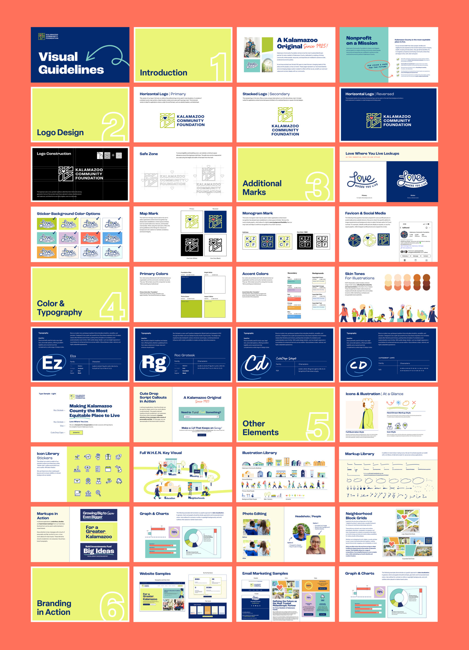
Logos
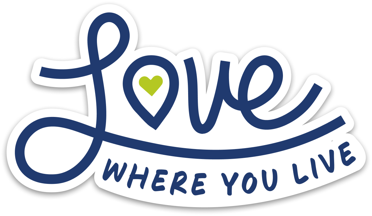
KZCF’s updated logo system is a visual celebration of Kalamazoo—its geography, its heart, and its people. The primary mark combines a stylized county map with a heart-shaped locator, symbolizing a strong sense of place and the care KZCF brings to every corner of the community. Supporting elements, like the flexible monogram and “Love Where You Live” lockups, bring added energy and adaptability, helping the brand show up consistently across everything from digital tools to neighborhood events.
Horizontal
Stacked

Icon/Mark
Brand Tone + Visual Language
KZCF’s brand voice and entire visual system were built to strike a balance between boldness and warmth. Part caregiver, part innovator, from type to colors to story, to style, every aspect was designed with intentional contrast to reinforce the strength of their 100-year organization while feeling humble and heartfelt.
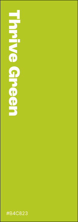
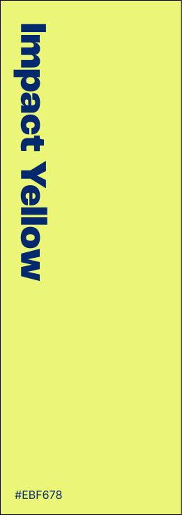
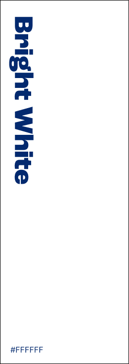
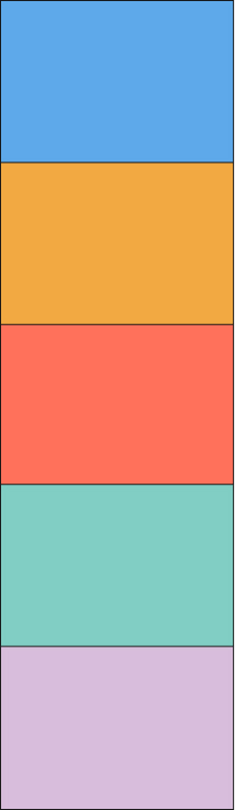
Colors


Typography
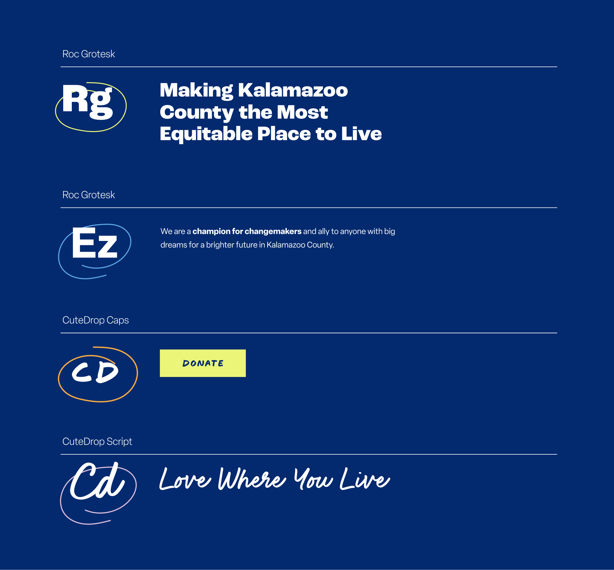
Icons + Markups

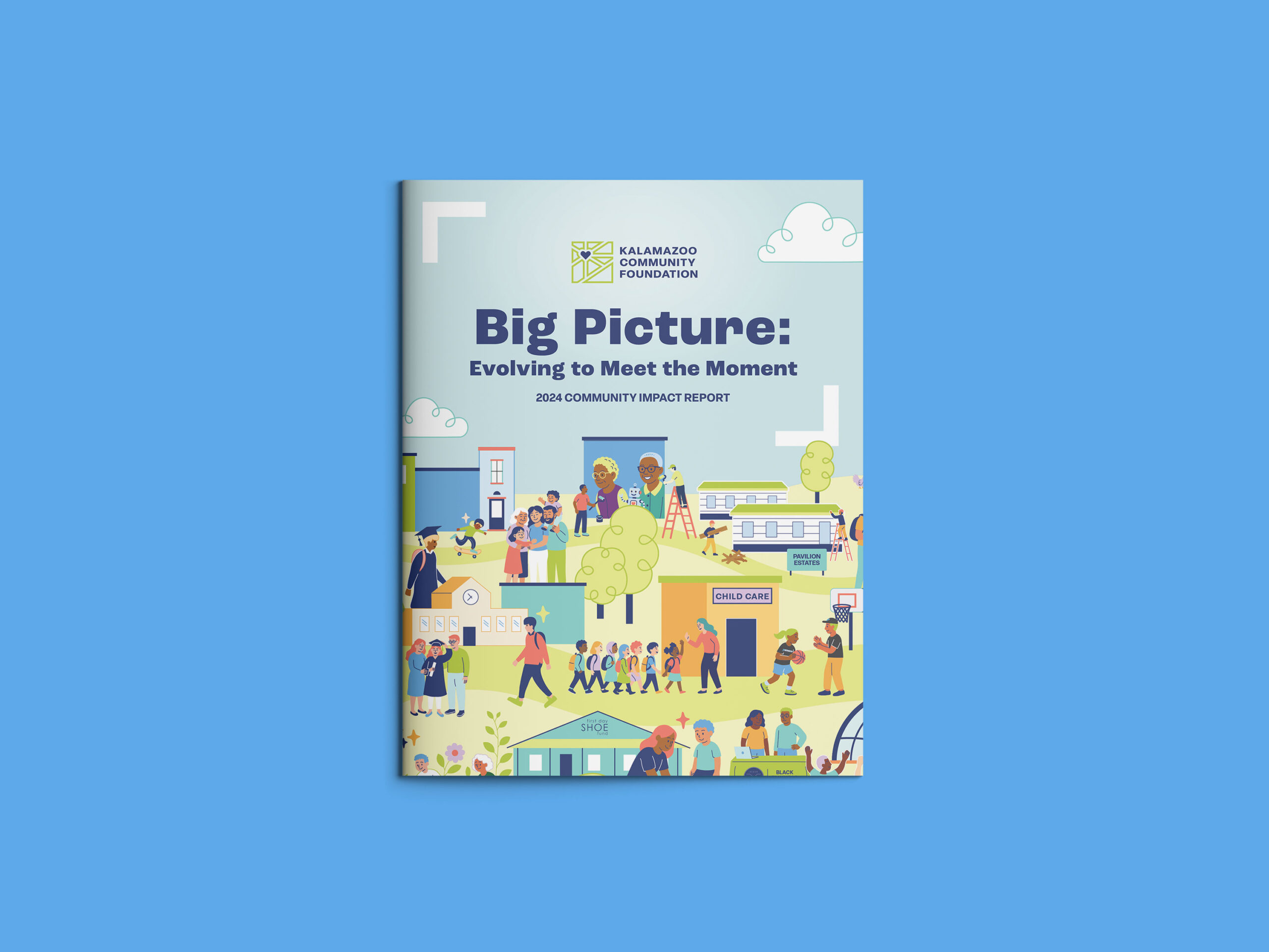
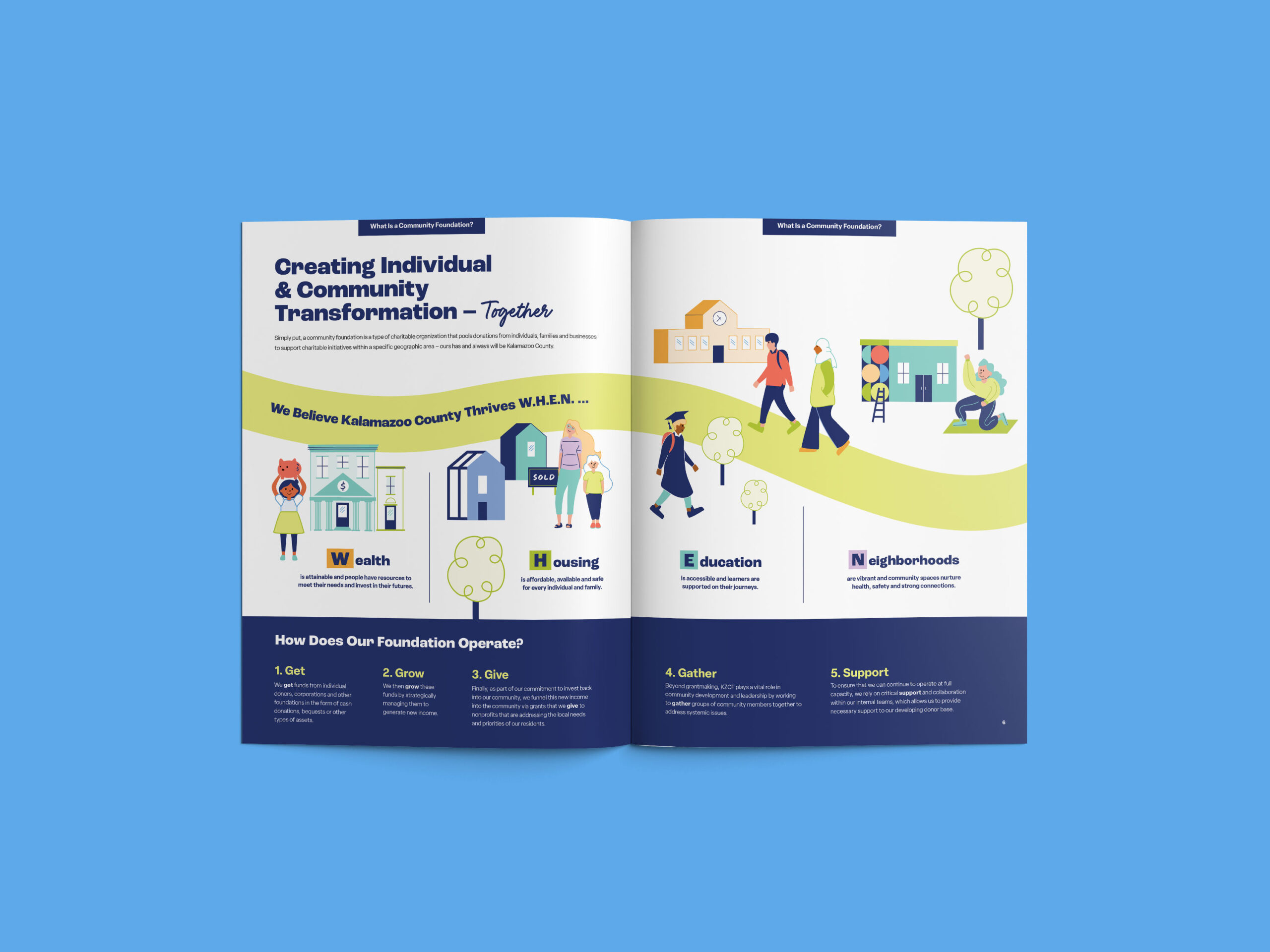
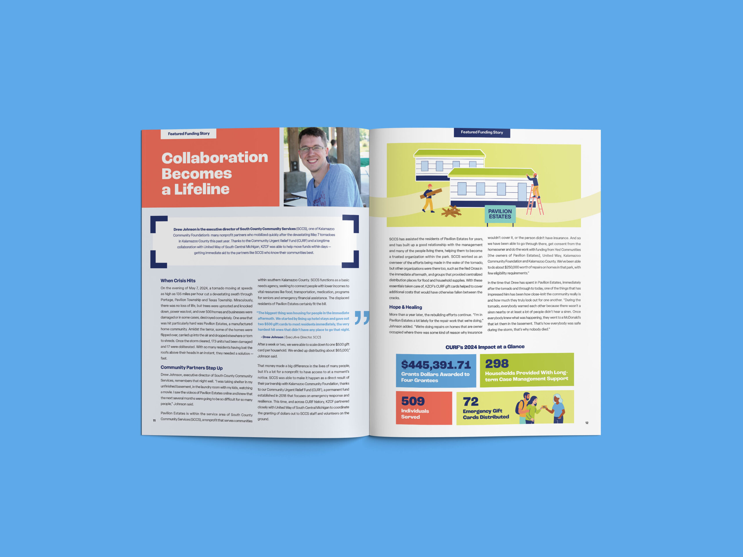
Illustration
Neighborhood Block Grids
Inspired by the structure and geometry of the logo, a flexible grid layout system was designed to help their in-house team create on-brand designs efficiently and easily. By mixing and matching imagery, colors, and text, this grid framework became a dynamic way to make cohesive compositions that reflect the brand’s energy, diversity, and commitment to serving all the people and neighborhoods within Kalamazoo County.

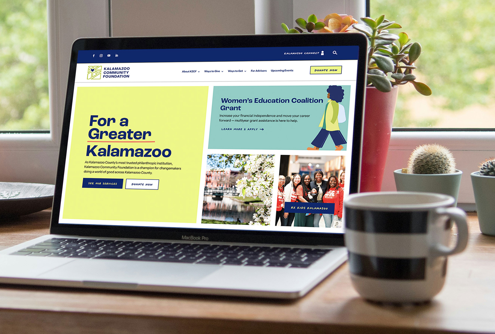
Website
KZCF needed a beautiful, accessible website that could do it all—build trust, empower donors, inspire action, and support robust features and in-depth storytelling all on a system their team could confidently manage with room to grow.
We brought their new brand to life online with a dynamic, content-rich WordPress site featuring simplified navigation, clear information architecture, and all the functionality their old site lacked. Built with accessibility and ease of use in mind, the new kzcf.org invites every visitor—from first-time donors to long-time partners—to join their movement for a more equitable Kalamazoo County.

Menu design // Submenu dropdowns were plussed up with branded icons and descriptive text for extra clarity and visual appeal.
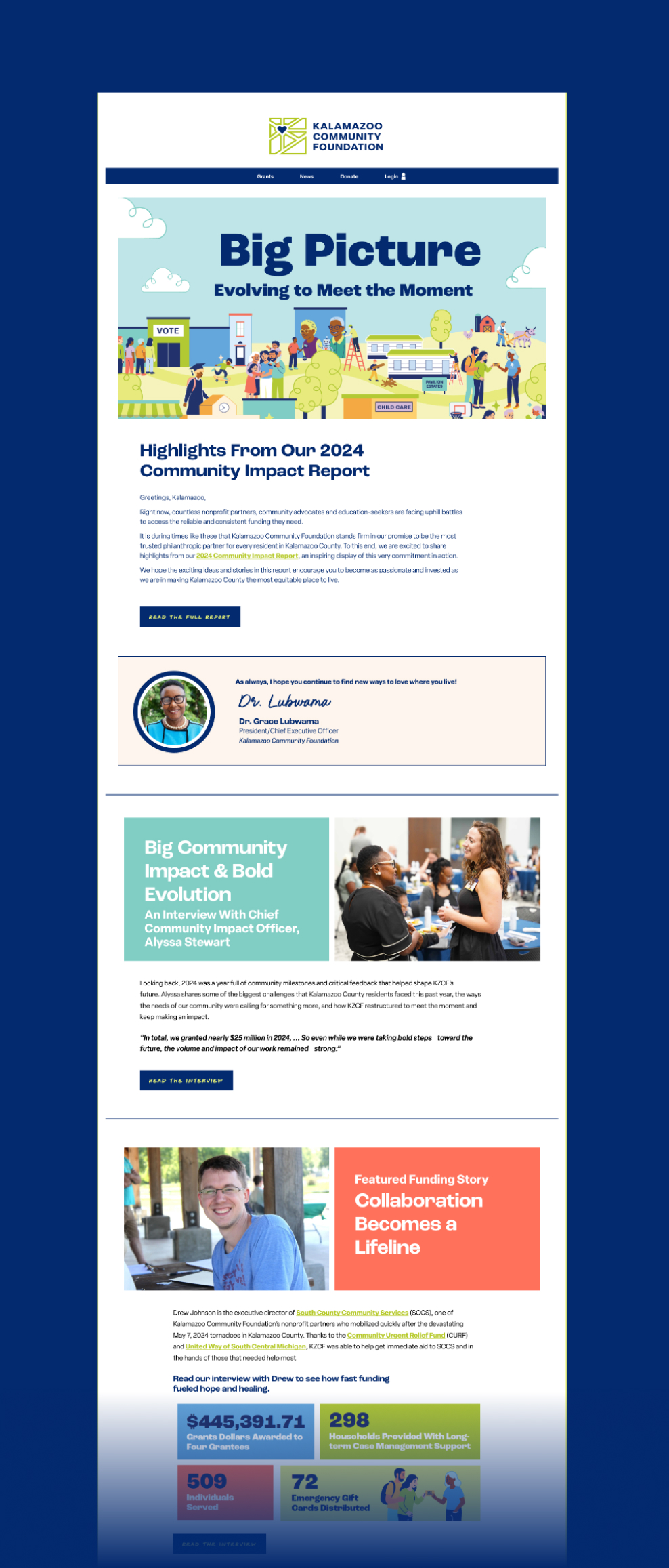
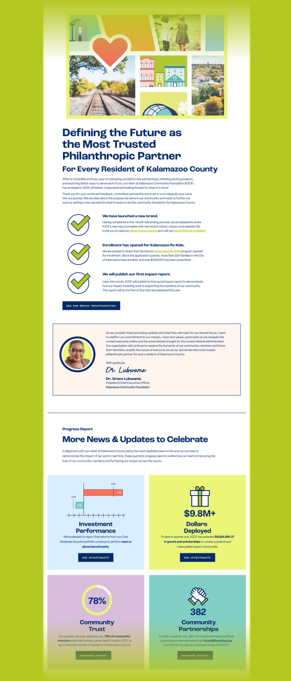
Email Templates + Campaigns
Once their new branding and website were unveiled to the world, KZCF was ready to rethink their approach to email and give their existing newsletter look a facelift, too.
We designed and wrote some of KZCF’s first rebranded campaigns in Mailchimp, including a set of designed templates that their in-house team could use easily and efficiently.
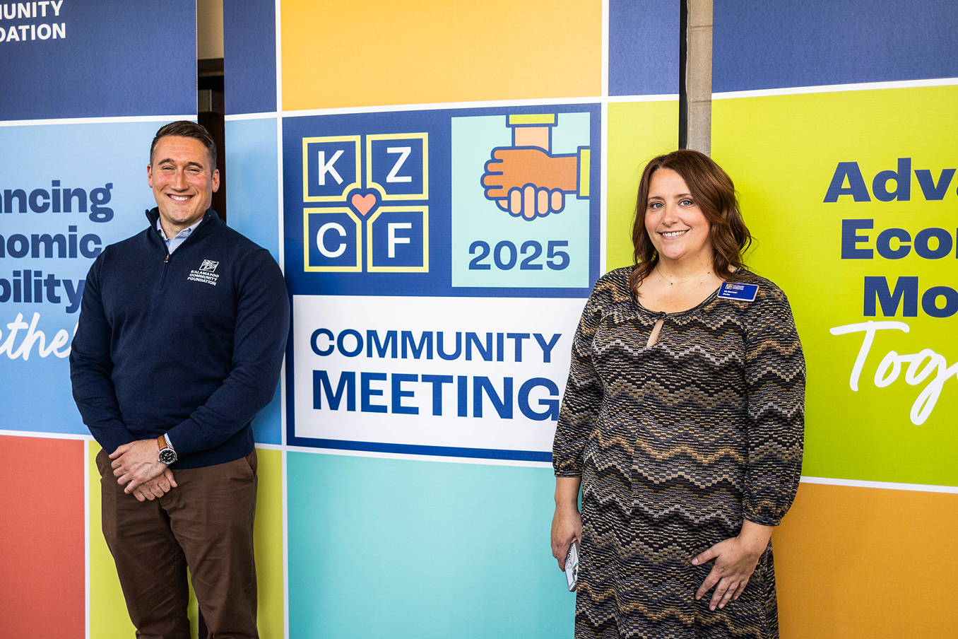
Event Design
Environmental graphics, stage backdrops, and wayfinding signage transformed KZCF’s 2025 Community Meeting into an immersive and memorable brand experience.
Entrance Wall Hanging Signs
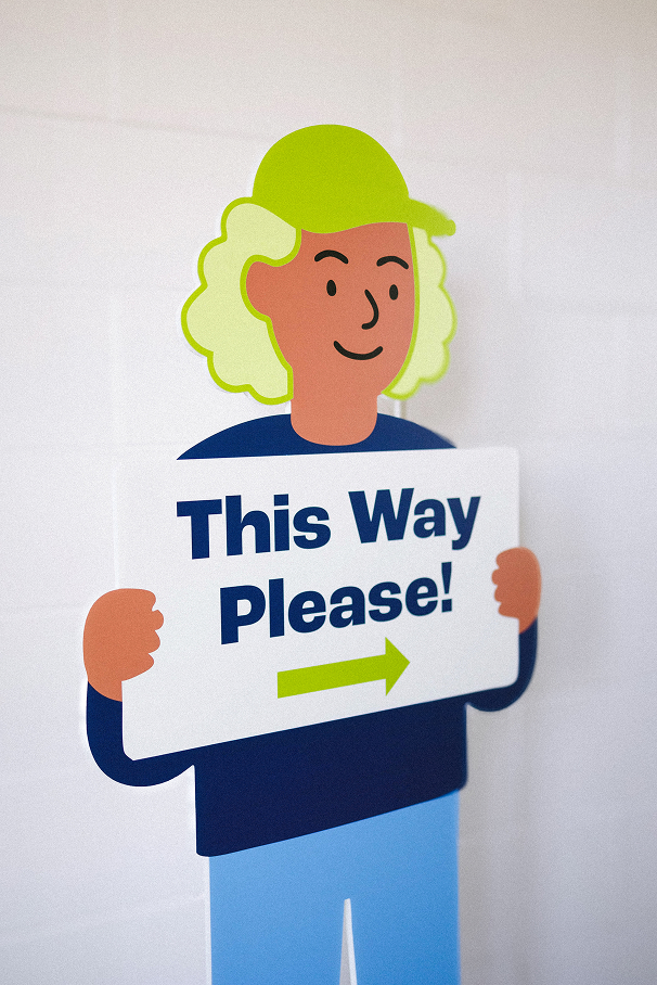
Wayfinding Cutouts
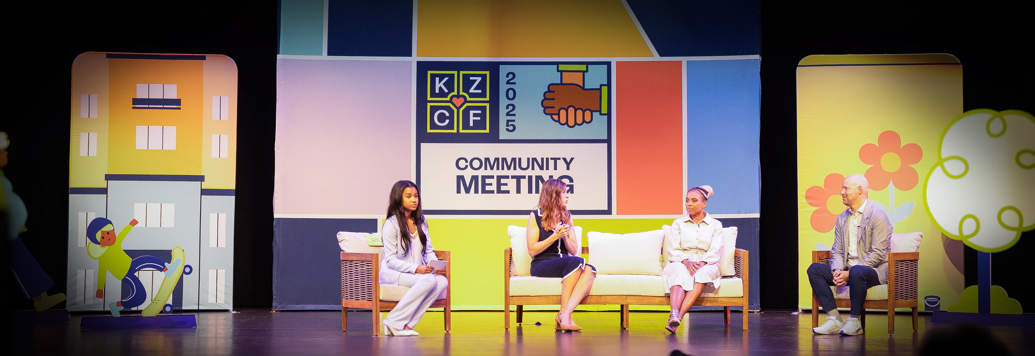
Stage Backdrop + Set Pieces
Additional Brand Applications

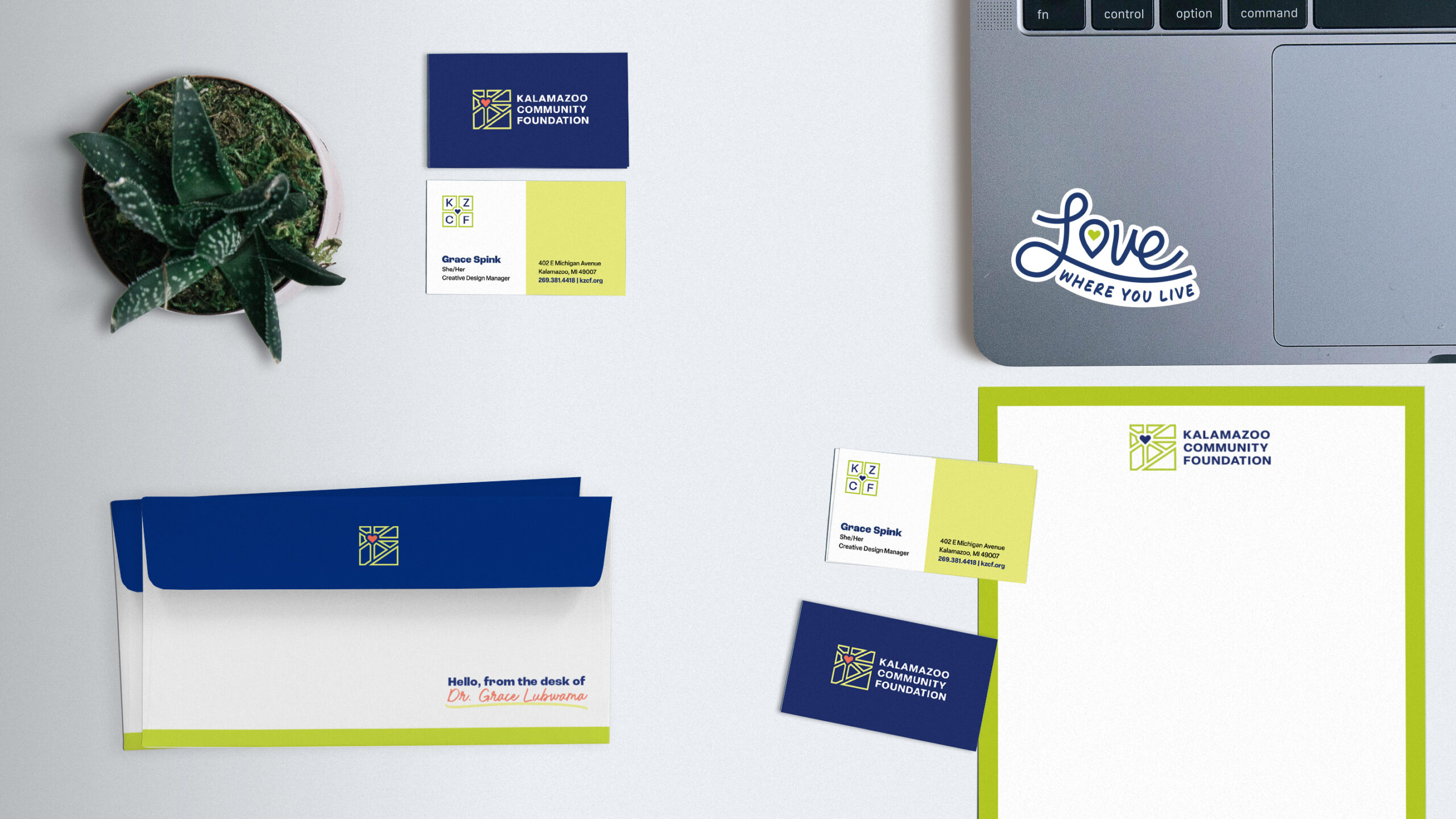
Business Cards, Envelopes, Letterhead + Stickers
Brand Guide
Complete with strategy documentation and a full messaging toolkit, comprehensive brand guidelines were developed to help KZCF maintain their brand voice and visuals among staff and promotional partners.