Wellspring Branding
A Milestone Rebrand for a Local Dance Legend
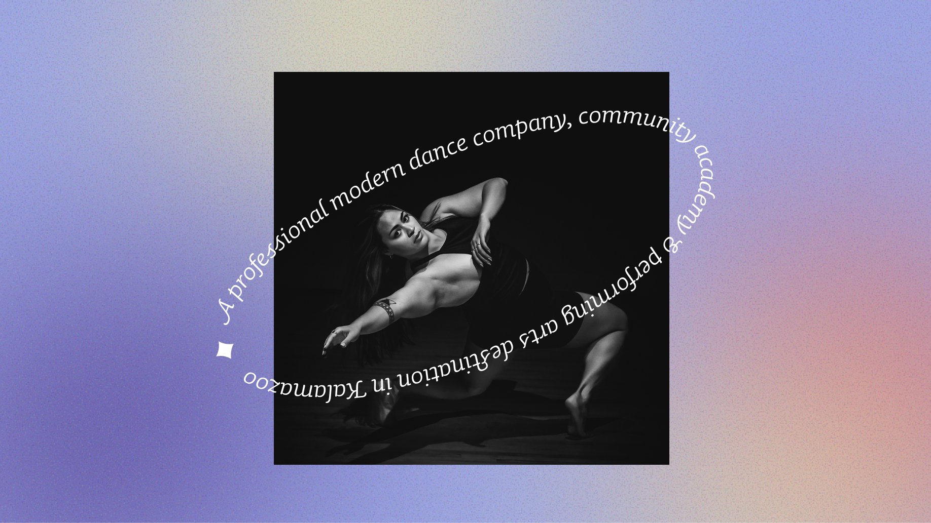
Wellspring, a modern dance organization rooted in the belief that dance belongs to everyone, was entering a major moment of transition as their founder and artistic director, Cori Terry, prepared to retire and pass the reins to new leadership.
Wellspring came to us for strategic repositioning and a brand overhaul to help them clarify their purpose, evolve their identity, and honor their founder and 40-plus years of history as they embarked on their next chapter.
Branding Project Scope
Logos
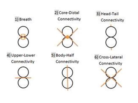
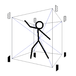
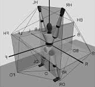
Inspired by our research into Bartenieff and Laban’s movement theories, we created an abstract mark symbolizing upper and lower body connectivity.
The ribbon-like letter forms with dynamic thick and thin linework bring the concept together in a way that feels expressive and unified.
Horizontal
Stacked
Badge
Icon


Research + Inspiration
Bartenieff and Laban movement systems (central to Wellspring’s approach to dance) were used as inspiration for the abstract structure of the final logo.
Brand Tone + Visual Language
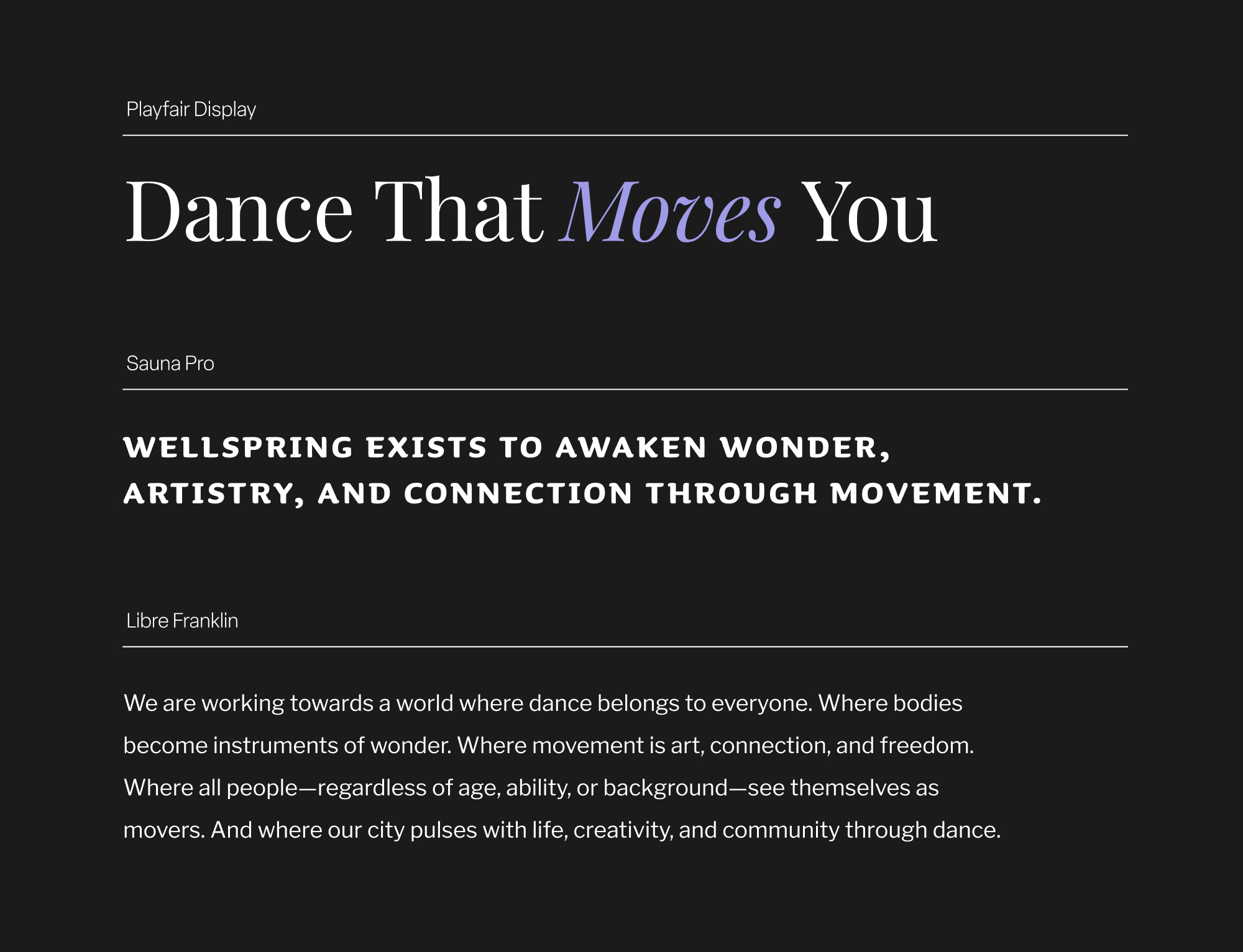
Colors and typography were carefully selected to honor their legacy brand, compliment the new logo system, and reflect all the vibrance and energy behind their work.
Colors


Typography
Icons
Brand Guide
A comprehensive rule book was developed to unify Wellspring’s visual identity and support confident, consistent application across all channels and mediums.